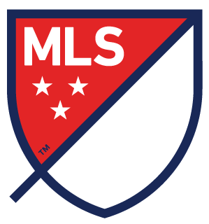
The MLS unveiled a new logo, and here’s the explanation of it from the MLS:
WORDMARK: MLS stands for Major League Soccer.
SLASH: The slash refers to soccer’s speed and energy. The slash begins outside the perimeter and drives upward at a 45-degree angle to illustrate both the nonstop nature of our game and the rising trajectory of our league. It bisects the crest to create a “first half” and “second half.”
STARS: The three stars represent the pillars of our brand: For Club, For Country, For Community.
PERIMETER: The perimeter represents the lines that mark off the field of play.
FIRST HALF AND SECOND HALF: The first half contains MLS and the three stars. The second half is an open white space that brings you in and out of the MLS world.
the new #MLS logo was created just so Henry has something to lean on. #henrying #MLSNEXT @NewYorkRedBulls #RBNY pic.twitter.com/WSq6QzQPKR
— ReadJunk.com (@readjunk) September 18, 2014


