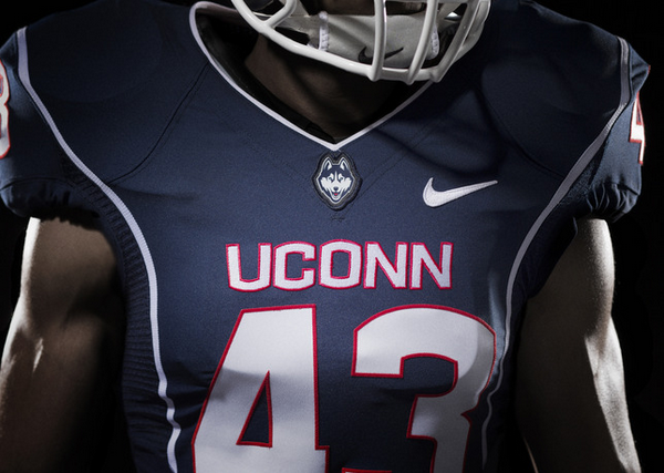
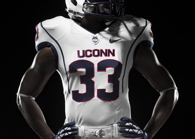
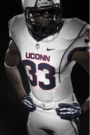
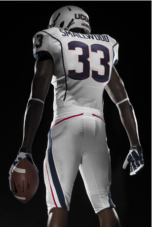
The UConn Huskies unveiled their new logo six days ago, and now they have released their new jerseys and helmet. The jerseys look great; the numbers and lettering are in a great font/color scheme and the logo placement on the neckline looks great. Even the thin stripe on the shoulders looks pretty good.
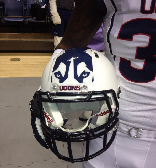
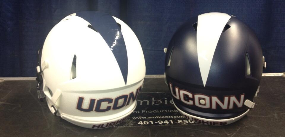
Unfortunately for UConn, they’re pairing these awesome jerseys with one of the worst helmets I’ve ever seen. Seriously, I get that they want to get away from the boring old “C” on the helmet but are these helmets a joke? These are atrocious and I hope the UConn fan base gives the athletic department a lot of flack for these; they’re inexcusable.
 [Lost Lettermen] [@JohnFSilver]

