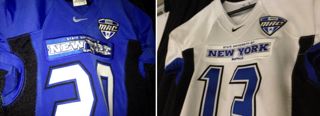
The Buffalo Bulls want to prove that they are the premier university in the state of New York, and by doing so, they ended up creating some horrible uniforms. Sure the general design of the uniforms is fine. The striping and the numbers actually look good on the uniforms, but the giant patch above the numbers is awful. You wouldn’t even know these were the Buffalo Bulls uniforms unless someone told you because “New York” is the easiest thing to read on the uniform. Whoever approved this idea made a horrible decision, and it won’t surprise me if these jerseys are changed next year.
[@UniWatch]

