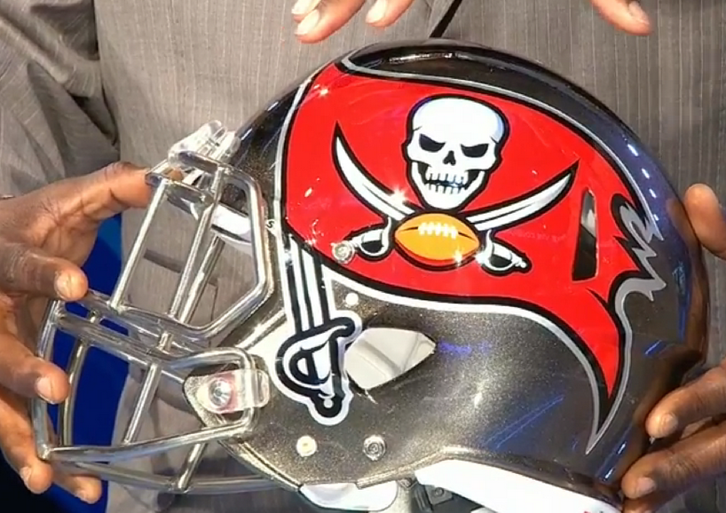
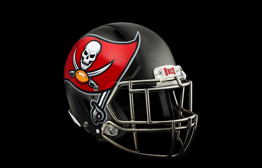
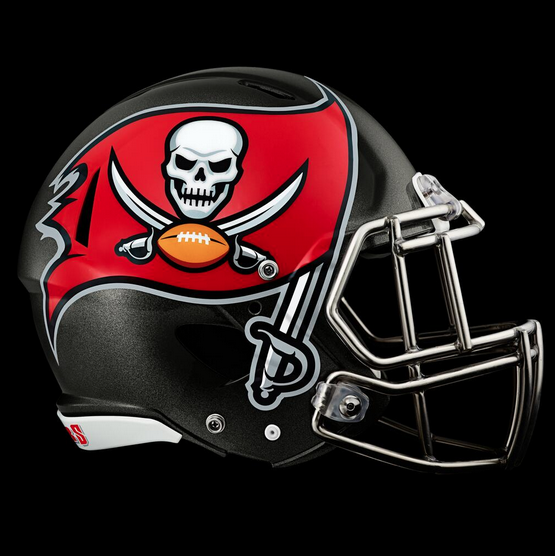
On Thursday night, the Tampa Bay Buccaneers unveiled a tweaked logo and a new helmet, though it would’ve been better if they hadn’t. The chrome facemask is nice and you can barely notice any changes to the actual logo, but enlarging it on the side of the helmet looks terrible. The oversized logo on a helmet has to be my least favorite new feature that has made it’s way onto the college football (and now the NFL) scene.
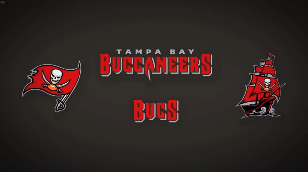
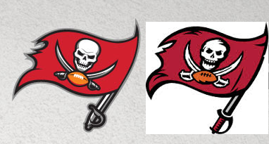
Here is a side-by-side comparison of the new and old logos.
They really should just go back to the creamsicle.
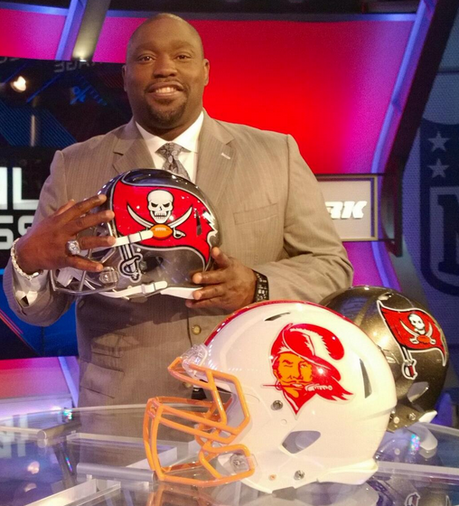
[Buccaneers]

