


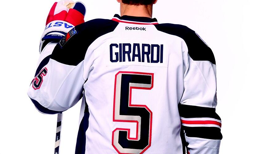
The New York Rangers and Chicago Blackhawks revealed their Stadium Series uniforms for their respective outdoor games and they are not good. At least the Rangers had a hysterical video for their jersey reveal, because that’s about the only thing that’s good about it. The dark blue in place of the normal Rangers blue is not a good look, nor is the “chrome” letters on the front.

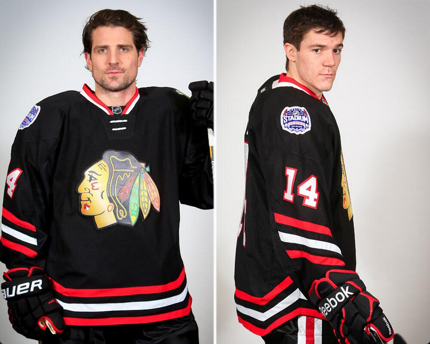
The Blackhawks regular jersey’s are one of the best jerseys in hockey and this stadium series jersey is terrible. I don’t understand why everything has a chrome/shimmery logo and the cut of the jersey (not straight along the bottom) looks awful. Reebok has whiffed pretty hard this year with the Stadium Series jerseys.