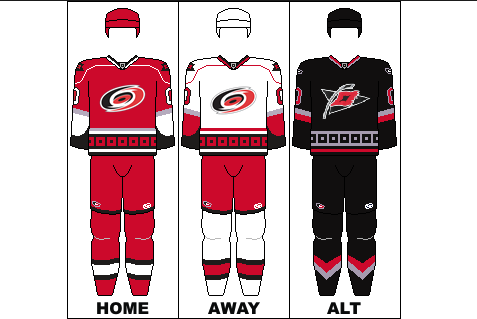
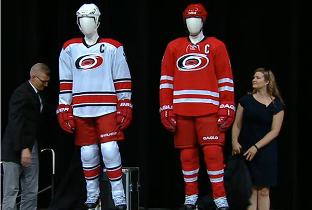
The Carolina Hurricanes haven’t changed their uniforms since they moved from Hartford to Carolina in 1998. After 15 years of use, the Hurricanes decided that they wanted to update their uniforms and they opted for a more simplistic look.
Old Uniforms:
The home uniform no longer has silver and black, aiming for white stripes and the only black on the uniform is the outline of the name and numbers. They added a lace to the chest to add a more classic look to their uniforms, which is part of the reason they went for a more simplistic look. The new font of the numbers and names was a great choice.
Rear view of the Canes set: pic.twitter.com/f8B1y1ZCuV
— Paul Lukas (@UniWatch) June 4, 2013
The road uniform added black for the numbers and like the home uniform, removed the “warning flag” band along the base of the uniform. They have also removed the shoulder logos and added red for a contrasting look on the shoulders. The Hurricanes also said that the black alternate uniform will stay in the rotation for next year.
Personally I love the Hurricanes new uniforms. I always thought their uniforms were too cluttered and had too much going on. They had logos on the shoulders, stripes around the shoulders, a band along the bottom of the jersey, and it was just too much going on. The classic look of the jersey, along with keeping their awesome logo the exact same, makes these jerseys a huge upgrade. I’d have to give them a solid A for their new jerseys, even though they look at bit like Team Canada’s Olympic jerseys.

