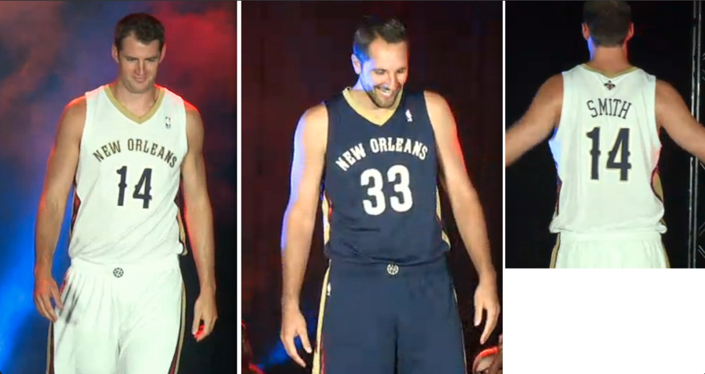
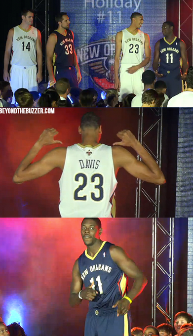
 The New Orleans Pelicans unveiled their new jerseys for next season on Thursday. They turned out to be pretty boring, but they far better than I had been anticipating. The jerseys would look much better if the New Orleans writing was larger, but the font they chose for the numbers and letters is pretty sweet. The color scheme works pretty well together, I just think that the logo should have been included more on the uniform.
 [@UniWatch] [@BeyondTheBuzzer]

