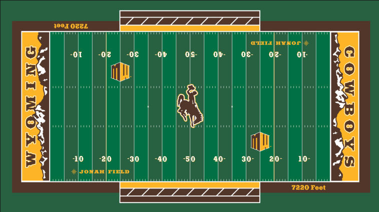
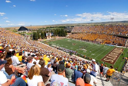
 I have to say I like this a hell of a lot more than the different colored fields that teams keep creating. There’s nothing out of the ordinary on the playing field, but the end zone design is crazy. Definitely a unique touch to put on their stadium and it looks great. You have to love the old school font for the end zones as well as the mountain ranges. Here’s what their stadium/field looks like now:
 [@UniWatch]


