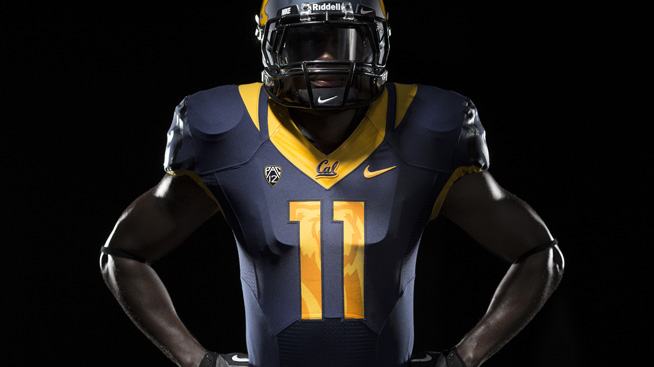
On Tuesday afternoon, the California Golden Bears Athletic Department held a press conference to unveil their new football jerseys. They will have a White, Gold, Blue and Grey set and could conceivably mix and match them to create more jersey combinations than they unveiled.
Footballscoop.com reported this:
“This is an exciting time for our athletic department and, frankly, for our university,” Barbour said.
Changing Cal’s visual identity was an 18-month process. What took so long? According to marketing director Todd Van Horne, Nike embarked on a five-step process that included studying Cal history and interviewing athletes. “Where innovation meets inspiration,” he said. Van Horne described the number fonts as “bold like a bear, sharp like a claw.”
“Brand is an essence, it’s a promise of what will be delievered, what will be experienced,” Barbour explained. “Logos, and fonts, and design are only meaningful to the degree they represent the university. Our goal is to have something that is universally recognized from which brand equity can be strengthened.” In non-marketing language: it’s important to have good uniforms. Again, we’re talking about an event where a font was described as “traditional yet modern”.
“It’s a completely innovative system of dress that you’ll see on the football field,” added Van Horne.
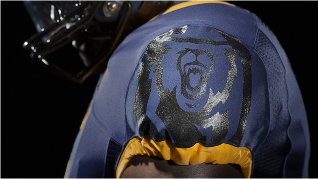
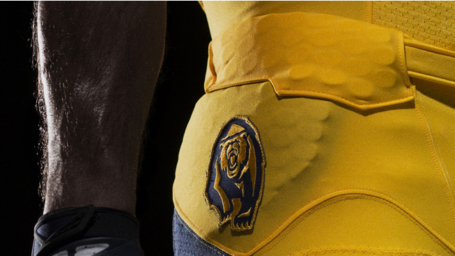
I’m a huge fan of these new jerseys. They didn’t change a lot, but the new bear logo is absolutely awesome. To incorporate the new logo as a shadow in the numbers is a phenomenal idea, and the logo placement on the shoulders and hip is sweet. It’s always nice to see an Athletic Department and Nike doing a great job creatively.

