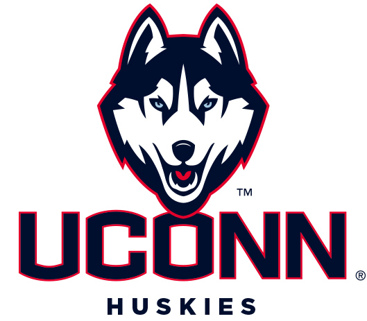
There had been rumors for a while that the Connecticut Huskies would be getting a new logo, and those rumors were confirmed on Thursday when the Huskies unveiled their new logo. The new logo will be used by all 24 men’s and women’s athletic teams and uniforms for those teams will not be unveiled until the fall.
From the UConn Today:
The two major changes will be the use of “UCONN” across the front of every uniform worn by each team, and a new look for the Jonathan Husky logo. The new look is part of a new institutional branding and marketing program announced in early April by President Susan Herbst that uses “UCONN” as the primary mark of the University in all signage, publications, advertising and marketing activities.
A new Husky dog logo was also developed as part of a review of all athletic team logos and marks, which in recent years had moved away from a consistent look on team uniforms.
Football had developed the block ‘C,’ men’s basketball had the intertwined ‘UC,’ women’s basketball had a ‘C’ around a basketball ball, and soccer and volleyball were developing hybrids from those. Only five of the 24 sport programs were using the Husky dog logo on their current uniform.
The new Jonathan Husky logo is a reflection of comments by coaches and student-athletes who participated in the process of reviewing the branding and logos used in the Division of Athletics.
The Husky logo hadn’t changed much since the 1980s but this new logo is a drastic change. Personally, I think the new logo looks fantastic. Much like the changes the Cal Golden Bears made, the UConn Athletic Department did a fantastic job. Sure it may be a change from the classic Husky logo, but UConn fans should be excited that the logo looks good and definitely more fierce than it did in the past. I do expect the uniforms to endure a big change with the addition of a lot of red in the new primary logo, so it will be interesting to see what they look like.

