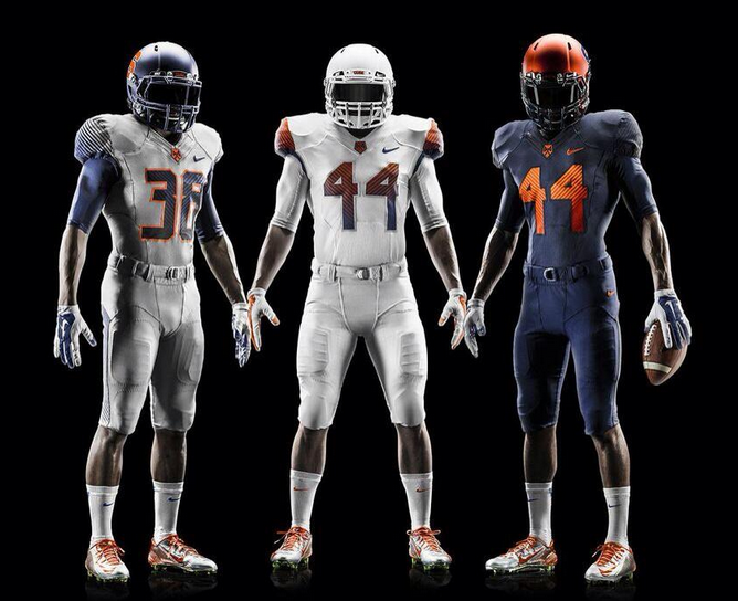
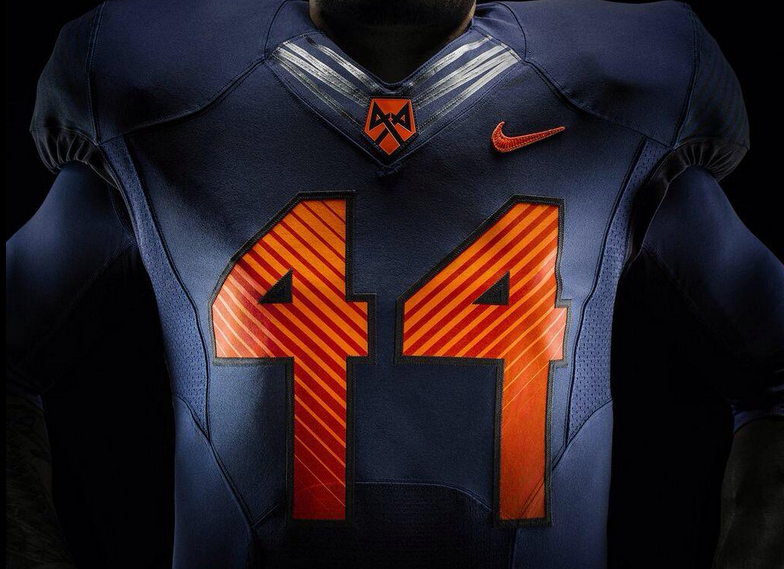
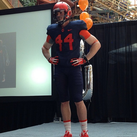
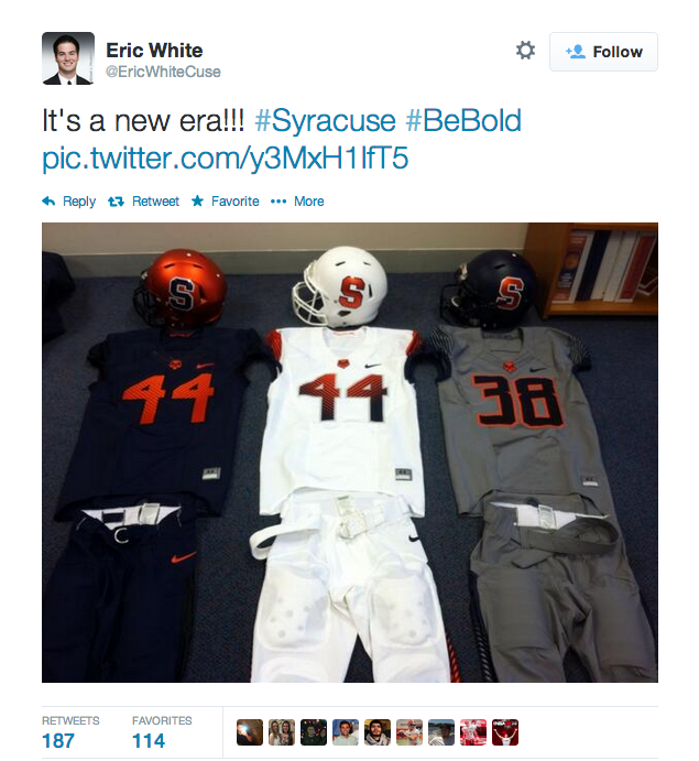
I’m not quite sure what was going through Nike and Syracuse’s heads when they designed these jerseys. They’re keeping the helmet they debuted from last year, which is pretty awesome, but the font they used for the numbers is just bizarre. The jerseys had potential, but the numbers completely blew it. The grey jersey looks pretty terrible in comparison to the other two as well.
[@NikeNYC] [@PhilHecken]


